VUSE FESTIVAL ACTIVATION SYSTEM
Client
British American Tobacco
Category
Experiential System · Festival Architecture
My Role
I led this as creative director and concept lead. The idea, the spatial language, the guest journey, and the modular logic were mine to set and protect. The disciplines around me, structural, fabrication, lighting, and field production, were collaborators I directed and relied on rather than work I claim as my own. My job was to hold one clear idea steady while a lot of specialists turned it into something that could ship, tour, and stand up outdoors.
Challenge
British American Tobacco needed a premium adult presence at festivals inside a category that cannot market the way most brands do. The footprint changed from site to site, the build had to deploy fast and tour hard, and a shipping container the client already owned had to be part of it. Most of the brief read like a list of reasons something could not be elegant.
The problem
Start with what made it hard, not what it looked like.
This work is easier to understand through its constraints than through its finished photography.
Every interesting decision on this project came from a constraint. Before there was a concept, there was a list of things that all had to be true at once, and most of them pulled against each other.
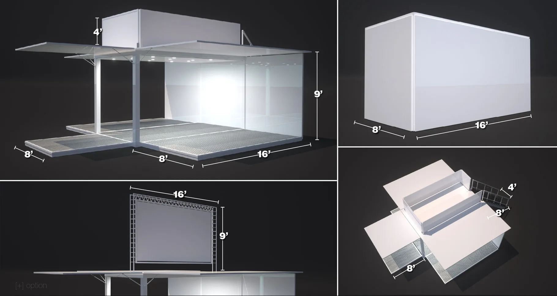
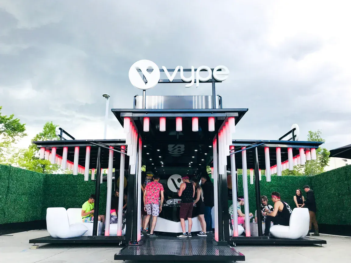
The category could not market like a normal brand. Age verification was mandatory and had to happen before anything else. The client already owned a shipping container that had to be used. The activation had to tour, deploy quickly, and reassemble on sites that were never the same shape twice. Through all of that it still had to feel premium, by day and by night.
What we designed against
- 01Strict nicotine marketing regulations
- 02Mandatory age verification before any product contact
- 03A client-supplied shipping container we had to build around
- 04Touring festival environments with changing ground and weather
- 05Rapid deployment and teardown
- 06Modularity across very different site footprints
- 07Premium brand expectations inside a regulated category
- 08Full day and night operation
- 09The hard, unglamorous realities of fabrication
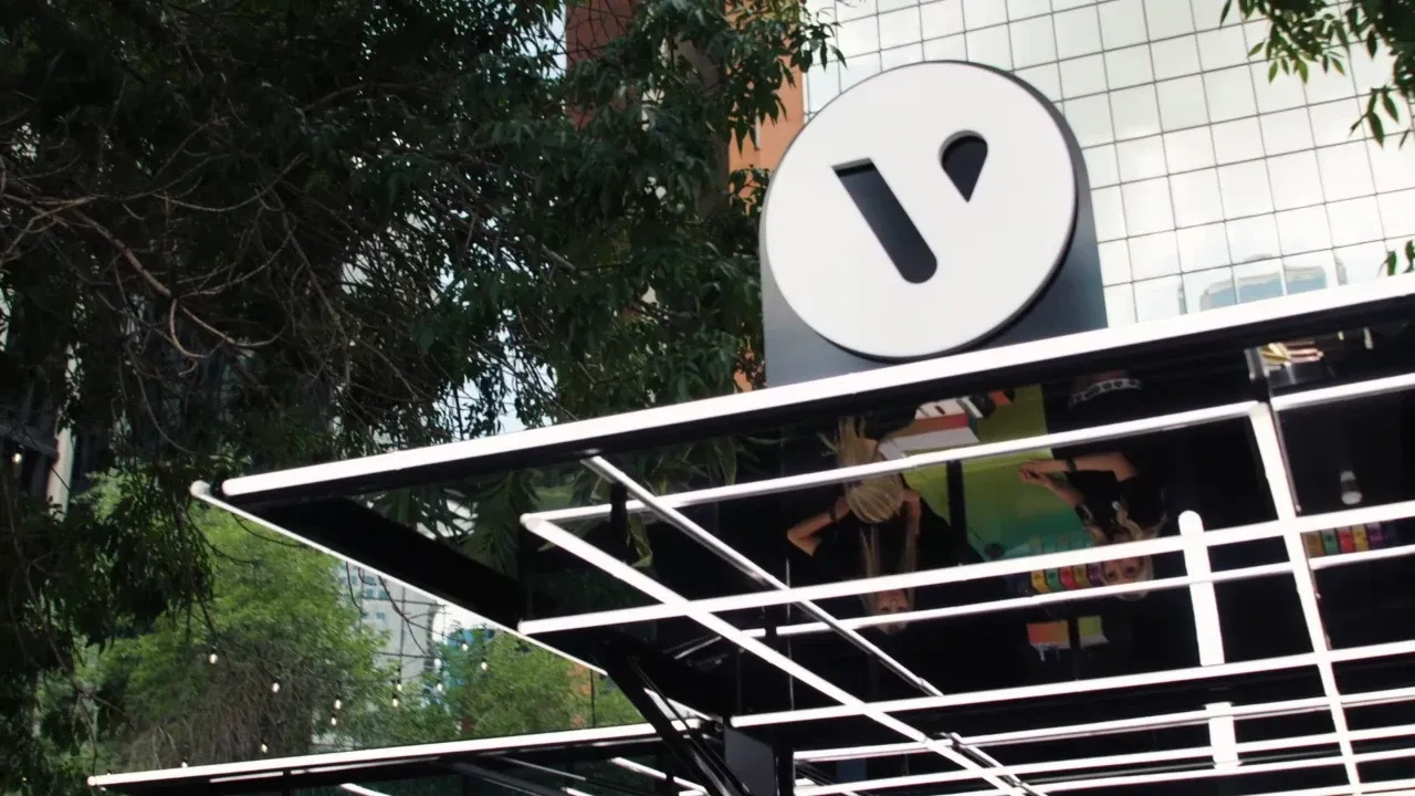
“The shipping container wasn't something to hide. It became the foundation of the architecture.”
The concept
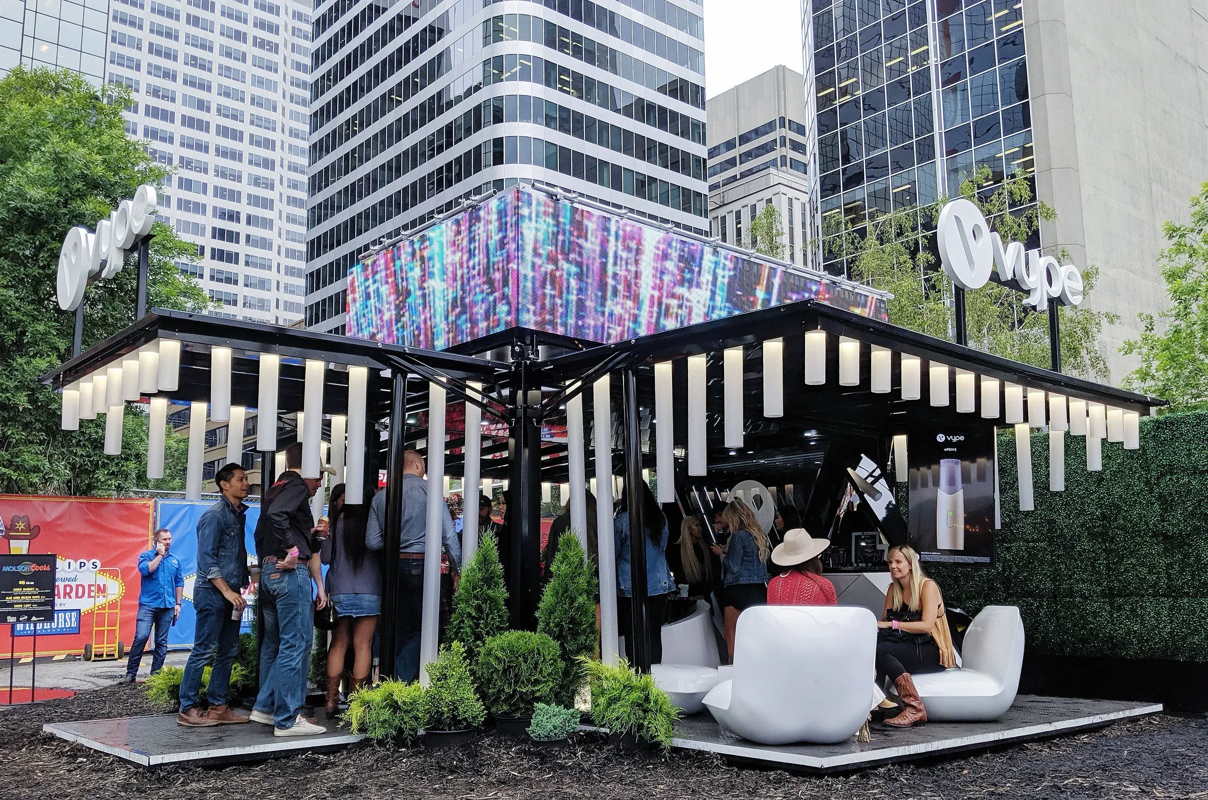
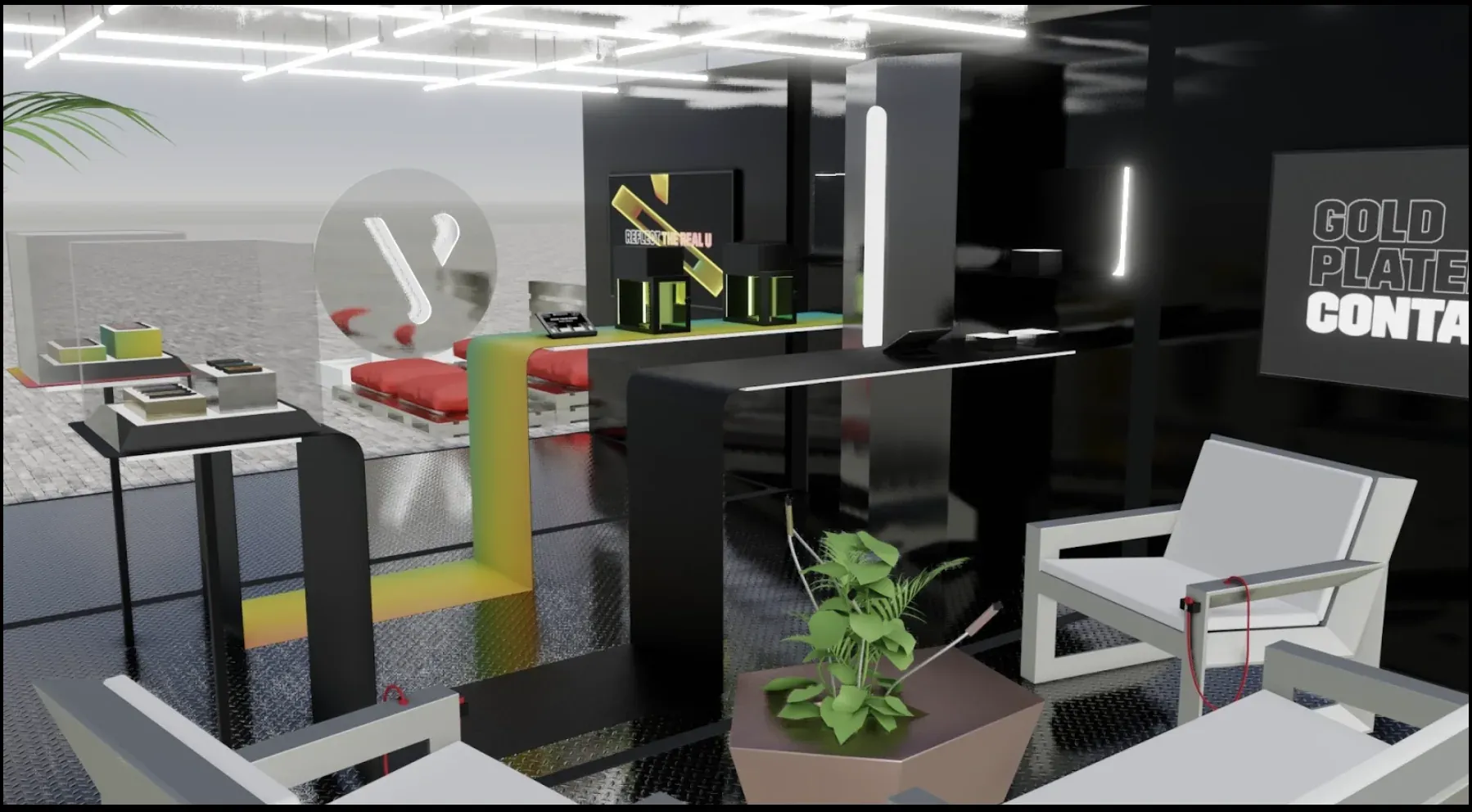
Make the container the architecture, not the problem.
The easy instinct was to dress the container up until you could not tell what it was. We went the other way and treated the container as permanent architecture, the fixed spine that everything else attached to.
Everything around it became modular. Decks, walls, canopies, counters, and screens were designed as parts that could expand, contract, and rearrange depending on the site. The goal was never a single beautiful object. It was a language that could be repeated and reconfigured, festival after festival.
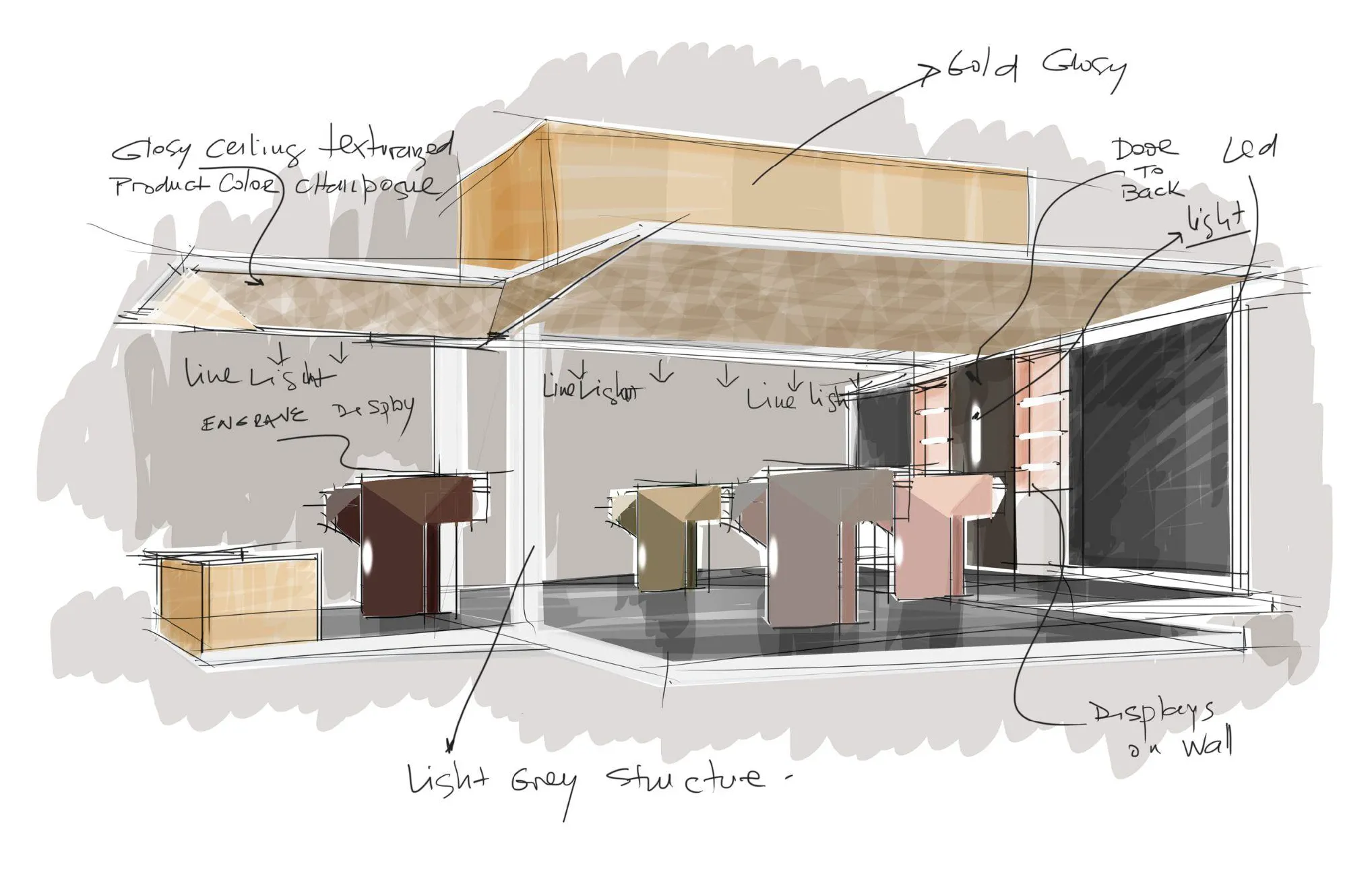
Experience design
A sequence where compliance never feels like compliance.
The visit was organized as a sequence of zones, each doing one job and handing cleanly to the next. The regulated steps were built into the rhythm of the experience so they felt like part of the visit rather than a checkpoint bolted onto it.
The guest journey
- 01Arrival
- 02Age verification
- 03Brand education
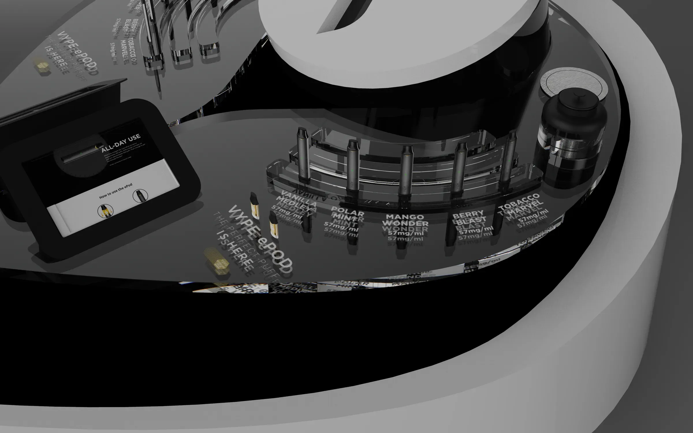
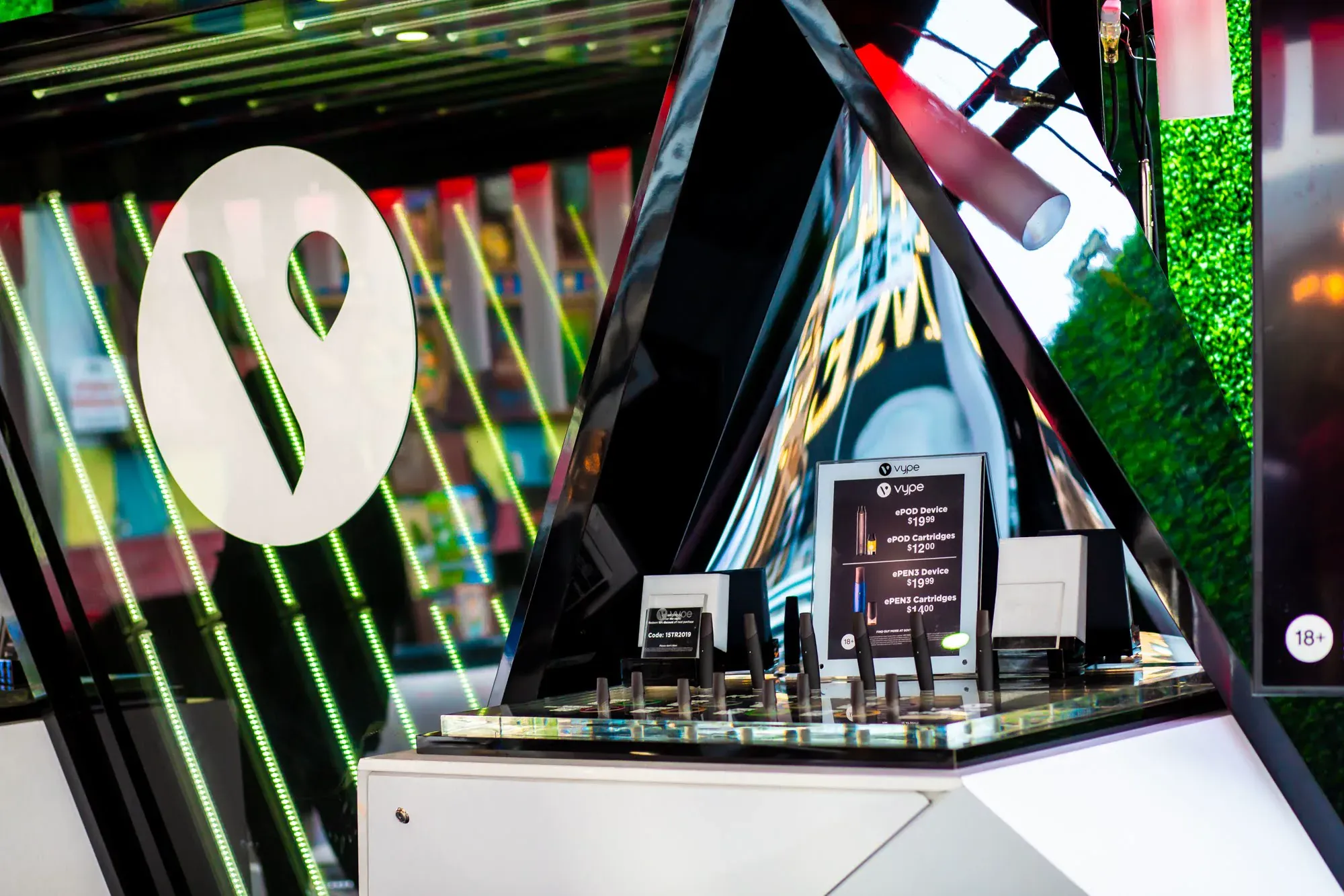
- 04Product discovery
- 05Product trial
- 06Lounge
- 07Exit
“Good experiential design makes operational requirements feel effortless.”
Day and night
A second building that only appears after sunset.
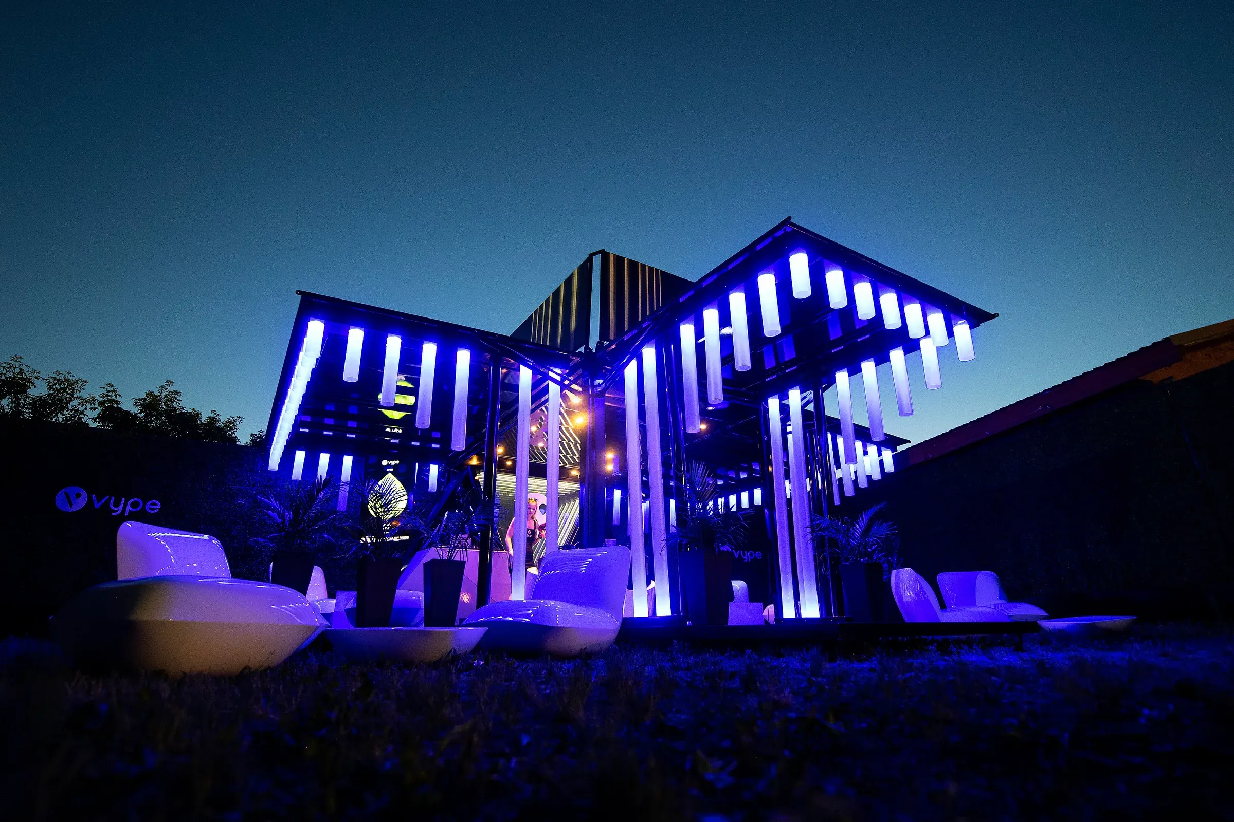
A large part of the architecture was designed for what happened after dark. Festivals change completely at night, and a presence that worked at noon would disappear by the time the crowd peaked.
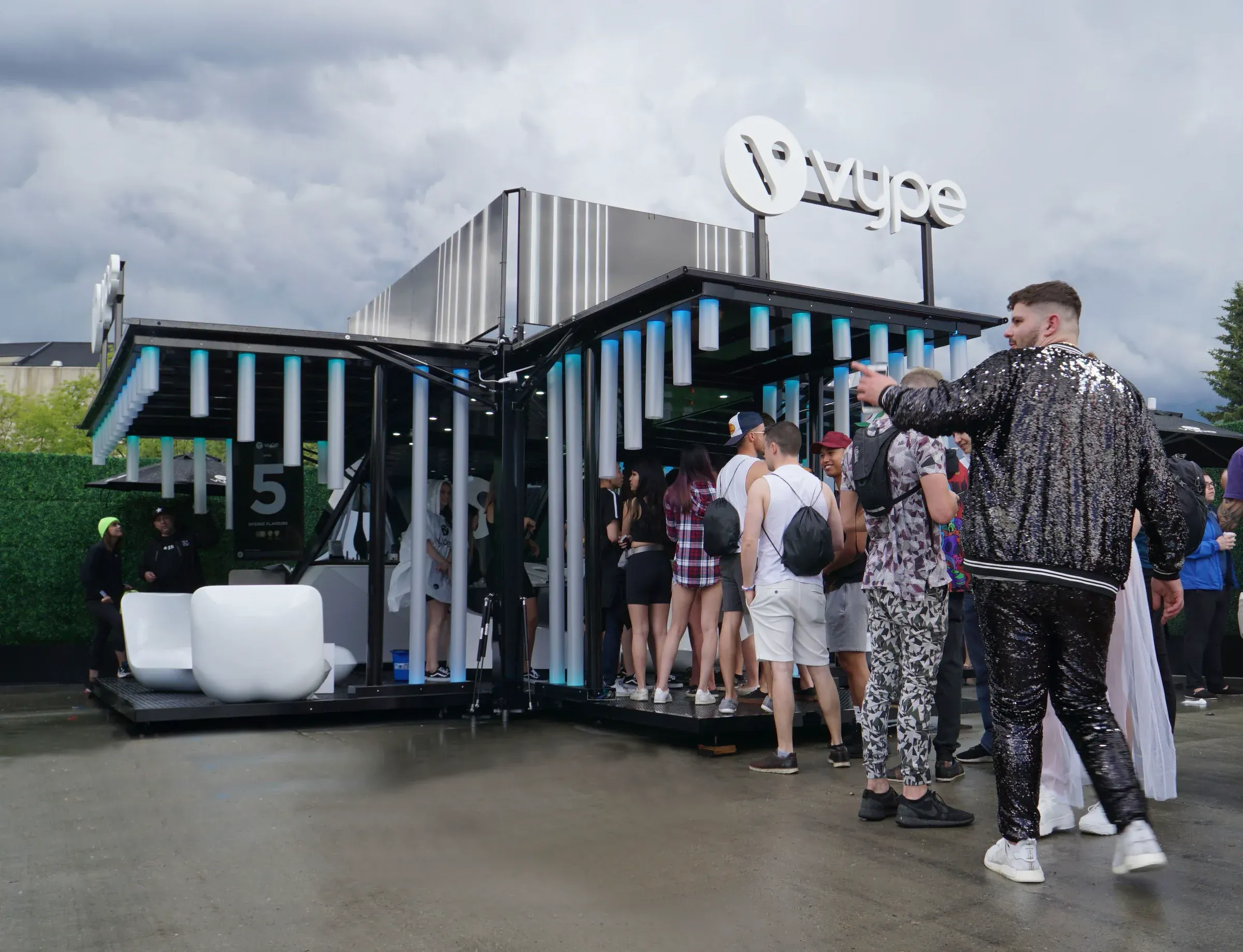
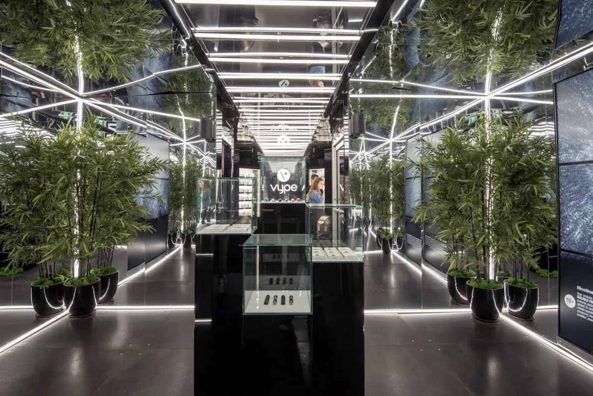
Lighting was treated as architecture rather than decoration. Integrated light, LED media, and glowing structural elements were built into the form, so the activation read as a landmark across the field at night and shifted into a different atmosphere up close.
Day
Night
Evolution
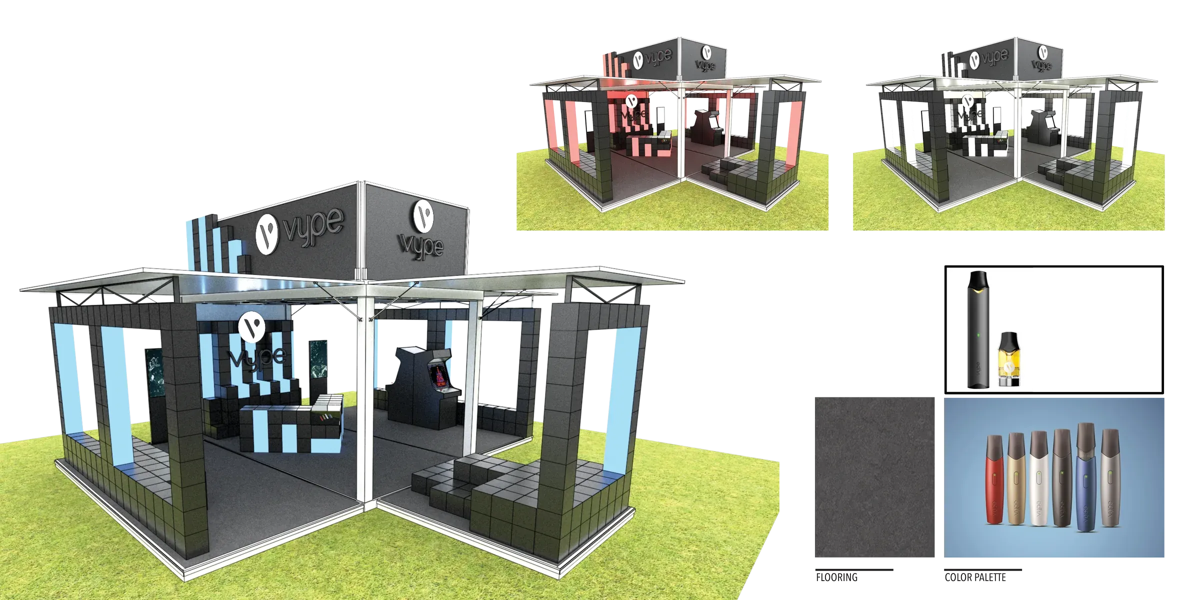
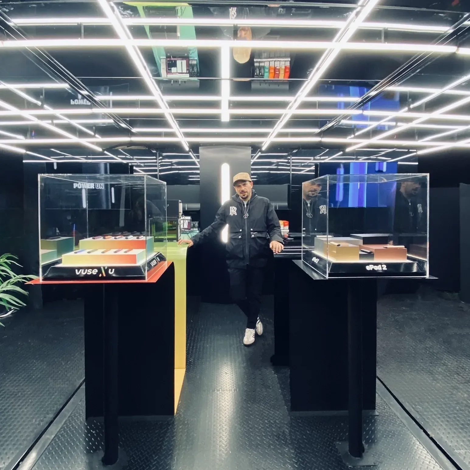
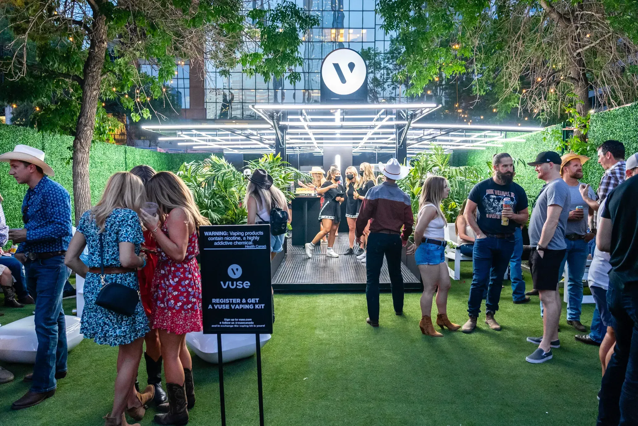
Vype became Vuse, and the system grew up.
The second year was not a redesign. When Vype became Vuse, we treated the rebrand as a chance to refine a system we had already watched perform in the field, not a reason to start over.
Traffic flow, branding, deployment, architecture, and product presentation were all tightened against what the first installation taught us. Real builds reveal things no rendering can: where people actually queue, which moments slow down, and what survives load-in.
Modular thinking
We were designing a system, not a booth.
The architectural language did not stop at the main pavilion. The same logic extended into a kit of parts that could appear on its own or alongside the container, so the brand stayed coherent whether it arrived as a destination or a single satellite piece.
Parts of the system
- 01A mobile trailer activation
- 02Product displays
- 03Merchandising fixtures
- 04Sampling fixtures
- 05Education displays
- 06Smaller satellite components
What this shows
Constraints became the concept, not the obstacle.
The work demonstrates
- 01Turning constraints into the concept rather than fighting them
- 02Systems thinking over one-off objects
- 03Experience architecture and guest journey
- 04Production-aware design that can actually be built
- 05Creative leadership across specialist disciplines
- 06Designing for fabrication and install, not just for renderings
- 07Balancing strategy with execution
- 08Working fluently inside a heavily regulated industry
- 09Protecting the original idea all the way through production
Outcome
It toured, it adapted, and it earned a second generation.
The activation toured major festivals and held up across very different sites. The modular approach did what it was meant to do: the same architectural language adapted to each footprint without losing its identity.
The clearest sign that it worked is that it was refined into a second generation rather than replaced. The project showed that a premium branded experience can live inside strict regulatory limits when the constraints shape the design from the start.
Reflection
The kind of problem I want more of.
This is the work I enjoy most. A large, ambiguous problem with real constraints, where the answer has to be a concept, an architecture, and a system all at once, and where a lot of people have to agree on one idea and then build it for real. The satisfying part was never the finished photography. It was watching a single idea survive regulation, fabrication, weather, and a year of lessons, and come out clearer on the other side.